The available data on country attributes is permanently growing and their access is getting more and more comfortable, e.g. in the case of a direct API for (nearly) all the world bank data. Many of those characteristics are genuin network relations between countries (like trade flows), thus, in the sense of Social Network Analysis (SNA) edges between nodes. However, it is still a challenge to visualize those international relationships, though there exist many programs that cope with that issue (e.g. Gephi).
Nevertheless, I would like to illustrate in this brief note the specific possibilities of combining the Networkx and Basemap package in Python, since it provides a „whole-in-one“ solution, from creating network graphs over calculating various measures to neat visualizations.
The matplotlib basemap toolkit is a library for plotting data on maps; Networkx is a comprehensive package for studying complex networks. Obviously, the relations between nations can be best represented if their network locations are equal to their real world geographic locations, to support the readers intuition about borders, allies and distances. That´s precisely the point here, additional enhancemenents will follow (e.g. how to calculate and visualize certain measures).
After you imported both packages (together with matplotlib) in your Python environment, we are ready to go.
from mpl_toolkits.basemap import Basemap
import matplotlib.pyplot as plt
import networkx as nx
First of all, we need to set up a world map style that will serve as background, but there are also many regional maps available, depending on what you want to show.
m = Basemap(projection='robin',lon_0=0,resolution='l')
In this case, I chose the classical „Robinson Projection“ (the other two arguments define the center of the map and the graphical resolution).
After the set up we can now ‚draw‘ on the map, e.g. borders, continents and coastlines, like in geography lessons.
m.drawcountries(linewidth = 0.5)
m.fillcontinents(color='white',lake_color='white')
m.drawcoastlines(linewidth=0.5)
Now you will get something like this:
To be sure, you can change the color and width of the lines, continents, seas and rivers with the subsequent arguments in each function. Letting rivers and lakes disappear is a bit more tricky, cf this issue stackoverflow.
Once our background is established, we can start and draw the positions of the countries. First, we need to define their position in respect of longitude and latitude, e.g. in terms of their geographical centre (click here for the coordinates):
# load geographic coordinate system for countries
import csv
country = [row[0].strip() for row in csv.reader(open(path + '\\LonLat.csv'), delimiter=';')]    # clear spaces
lat = [float(row[1]) for row in csv.reader(open(path + '\\LonLat.csv'), delimiter=';')]
lon = [float(row[2]) for row in csv.reader(open(path + '\\LonLat.csv'), delimiter=';')]
# define position in basemap
position = {}
for i in range(0, len(country)):
position[country[i]] = m(lon[i], lat[i])
Now Networkx comes into play. With ‚position‘ we can define the ‚pos‘-argument of the nx.draw-function, thus that we can match the coordinates of each coutnry with any Networkx graph where the names of the nodes are countries. To match similar one´s more easily (and saving you tons of time cleaning your data), use this nice little function:
def similar(landstring, country):
 l = difflib.get_close_matches(landstring, country, 1)
 return l[0]
Then we are ready to connect our network with the position via (here are the data of our example graph):
pos = dict((land, position[similar(land)]) for land in G.nodes())
Almost done. The last step is to define your network attributes you like to visualize in your graph. In our case, the connections between the countries represent international scientific collaboration in Economics and their subsequent communities (variable ‚part‘) according to the modularity algorithm.
nx.draw_networkx_nodes(G, pos, nodelist = [key for key in part if part[key] == 0],
 node_size = [deg_weight[s]*10 for s in part if part[s] == 0],
 node_color = 'red', node_shape='^', alpha=0.8)
 nx.draw_networkx_nodes(G, pos, nodelist = [key for key in part if part[key] == 1],
 node_size = [deg_weight[s]*20 for s in part if part[s] == 1],
 node_color = 'black', node_shape='d')
 nx.draw_networkx_nodes(G, pos, nodelist = [key for key in part if part[key] == 2],
 node_size = [deg_weight[s]*10 for s in part if part[s] == 2],
 node_color = 'green', node_shape='o')
 nx.draw_networkx_nodes(G, pos, nodelist = [key for key in part if part[key] == 3],
 node_size = [deg_weight[s]*10 for s in part if part[s] == 3],
 node_color = 'blue', alpha=0.8)
 nx.draw_networkx_edges(G, pos, color='grey', width = 0.75, alpha=0.2)
 plt.show()
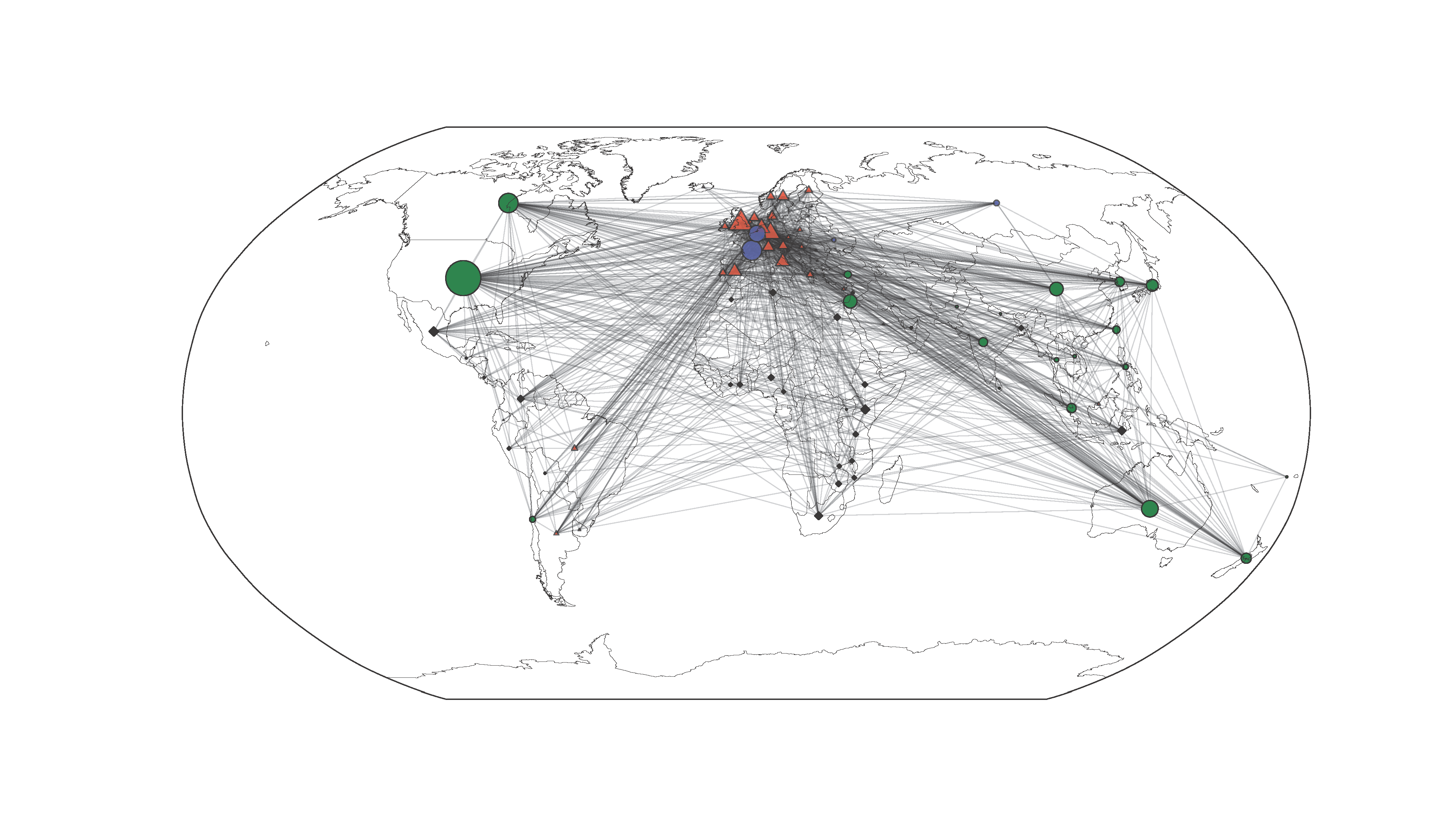
You see the effect of the different arguments in the draw_networkx_nodes/edges command in terms of node color, size or shape. That´s where you modify your graph.
In our example you realize at a glance that there a historically and politically rooted collaboration preferences in the economic field, with a bipolar Europe, a rather peripher community of Third World countries and a dominating global group arranged around the US. Due to the basemap background and the geographic coordinates of the nodes, this relationships are immediately and intuitively apparent.
very nice example.
thank you so much.
Thanks for this example. I need to create something similar, but I get stuck on the part where you define the network. You haven’t defined the graph G using the data in the text file.
Thanks for your comment Sophi!
The txt file is a pickle, if you just load it, you get a well-defined graph with nodes and edges! Cf details http://stackoverflow.com/questions/11025126/read-write-networkx-graph-object
Thanks, but I get an error right away to do with copy_reg. The command is G=pickle.load(open(path + ‚/graph.txt‘))? It’s not obvious to me the pattern of nodes in the txt file. From what I understand, you need a graph G of pairs of nodes such as [(‚New Zealand‘, ‚Australia‘)] and then you attach the position so Python knows the location.